Go to the U of M home page

Tuesday, December 12, 2017

Charter Schools Contribute to Racial Sorting and Segregation

A recent AP report about racial segregation in charter schools has spurred controversy, as some charter advocates have pushed back against the idea that charters could be a cause of segregation.

The Institute on Metropolitan Opportunity has conducted new analysis of national school enrollment data from 2014-2015. This analysis supports the conclusions of the AP report. It suggests that students in charter schools are more likely to be sorted by race than students at traditional schools.

The analysis compares the racial enrollment demographics of charter and traditional schools to the demographics of resident students in the municipalities in which the schools are located. The data, obtained from NCES, includes virtually all American public schools, with the exception of a small number of schools for which demographic figures are unavailable.

Key findings include:

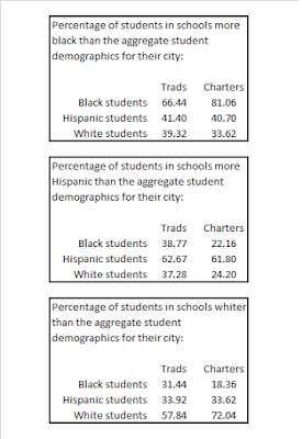
  • 81 percent of black students in charter schools attend a school that is more black than the overall student population of their city, compared to 66.4 percent of black students in traditional schools.
  • 72 percent of white students in charter schools attend a school that is whiter than the overall student population of their city, compared to 57.8 percent of white students in traditional schools.
  • Compared with traditional schools, a substantially smaller percentage of black and white students in charter schools attend a school with a higher share of Hispanic students than the overall student population of their city.

In short, charter enrollment shows clear signs of racial "sorting," in which students attend schools that are disproportionately composed of their own racial group. A table with full findings is included at the bottom of this post.

The following graph, depicting almost every American charter school, helps illustrate the basic nature of charter sorting. Each point is a single school. The horizontal axis represents the white percentage of the overall public school enrollment of the school's municipality; the vertical axis is the white percentage of the school's own enrollment. Bubbles are scaled to the absolute number of white students enrolled in a school. (Click the graph to enlarge.)


Any school above the diagonal line is more white than the municipality's students overall. Any school below the line is less white.

As can be seen, the vast majority of white students are enrolled in charters that are whiter than the overall enrollment in their city. Moreover, most white students enrolled in a more diverse school are already located in a very white city.

The next graph depicts the same data, but instead scales the bubbles to overall nonwhite student enrollment. Once again, it is clear that a large share of nonwhite students are enrolled in a school that is more segregated than their city's overall enrollment (i.e., below the diagonal). Indeed, the pattern is stronger than it may initially appear, as a huge number of overlapping schools are concentrated in the bottom left quadrant of the graph.


In order to better highlight this concentration, a third graph uses the same data, but removes the scaled bubbles for clarity. In this graph, an orange box contains all charter schools that are both less white than the surrounding city's overall enrollment, and more than 90 percent nonwhite (or, the parlance of our earlier reports on charter segregation, "hypersegregated.")


53 percent of all nonwhite charter school students attend a school in the orange box. In other words, 53 percent of nonwhite charter students attend a school that is both highly segregated and more segregated than nearby traditional schools.

Below is a table with full data on racial sorting in charters. As can be seen, compared to traditional school students, charter students are typically more likely to be exposed to members of their own racial group and less likely to attend schools with a disproportionate share of other racial groups.


This is not the final word on charter segregation, of course. A city may be diverse overall but segregated internally; the traditional schools nearest a charter may be themselves segregated. In addition, although municipal boundaries permit for more convenient comparative analysis, district boundaries are often more relevant for students. The two do not always align: some cities are split between multiple districts, while other districts include multiple cities. We hope to address some of these issues in subsequent analyses.

Nonetheless, the data currently available strongly supports the idea that, compared to more traditional public schools, charters are contributing to increased school segregation.

Wednesday, May 24, 2017

Is subsidized housing creating affordability?

It's a frequent complaint of subsidized housing residents: affordable housing isn't. Politicians might claim new subsidized units are keeping a neighborhood affordable, but those units are, in actuality, no cheaper to live in than the building next door. Often, they're more expensive. In order to rent a so-called "affordable" unit, you need a well-paying job or a Section 8 voucher.

Despite this, subsidized housing development is routinely justified as necessary to protect struggling neighborhoods. Without more subsidized units, it's said, low-income families will be displaced, driven out by market-rate rents they just can't afford.

Both these narratives can't be true at once: either subsidized housing keeps neighborhoods affordable, or it doesn't. So which is it?

The low-income housing tax credit program (or LIHTC) is the nation's single largest housing subsidy. Most subsidized housing projects over the past several decades have involved some level of tax credit investment. Landlords operating tax credits buildings are requested to submit detailed occupancy data to HUD, Although this data isn't perfect, it provides a fairly detailed look at who is living in subsidized tax credit units, and what they're paying.

The graph below includes 398 Twin Cities LIHTC projects in operation in 2015, accounting for about 27,000 units. The horizontal axis is the average rent in each project's census tract, and the vertical axis is the average rent paid by families in each project, as a percentage of the tract average. If a project is above 100 percent, residents are paying higher rent than their neighbors do, on average. (Click to enlarge.)


What this graph shows is that many LIHTC projects, particularly in Minneapolis and Saint Paul, actually charge average rents that substantially exceed neighborhoods rents. This is especially true when those projects are located in lower-rent (and typically lower-income) areas.

These projects are not the exception - they're the rule. About 60 percent of Minneapolis and Saint Paul LIHTC units are less affordable than the neighborhood in which they are situated - approximately 8,050 of 13,370 units.

While there are also above-market LIHTC projects in the suburbs, the problem is less pronounced: 4,570 of 13,600 units, or 34 percent. (It should be remembered, however, that affordable housing in the suburbs tends to be located in somewhat higher-rent census tracts than in the central cities.)

Anecdotally, this reflects the complaints of subsidized housing tenants. But the breadth of the problem ought to disturb housing activists. The implication of this data is that well over half of the housing tax credits spent in the central cities produceno additional affordability in their neighborhoods.

We shouldn't mince words here: if the purpose of the tax credit program is to create housing that's cheaper to rent than what already exists on the market, it is failing. In fact, in Minneapolis and Saint Paul, the aggregate effect of this housing is to make neighborhoods more expensive to live in.

This failure is not universal. In higher-rent (and thus higher-income) neighborhoods, LIHTC rents are significantly lower than market rents. In these areas, tax credit development is providing affordability where it did not previously exist, opening up these neighborhoods to residents who may otherwise be unable to live there. That, in turn, can expand economic and educational opportunity for those tenants. But there is little coordinated effort to pursue LIHTC development in affluent neighborhoods, and, at present, the majority of tax credits units are located in low-income areas.

Interestingly, there appears to be little correlation between neighborhood rents and LIHTC average rents. The graph below shows the same data as above, but use the absolute rents for both projects and neighborhoods, instead of displaying the former as a percentage of the latter. Projects above the line are charging average rents above neighborhood rents.


Not only are plenty of higher-rent buildings located in low-rent tracts, but a handful of extremely affordable buildings are located in comparatively expensive tracts.

Given the apparent failure of LIHTC development to make low-income neighborhoods more affordable, what is the justification for conducting subsidized development in these places? A handful are frequently offered, but none are very convincing.

First, newly developed subsidized units are usually of higher quality than older market-rate units, especially in poor neighborhoods. But if the goal is improving the quality of the housing stock, there are cheaper and more direct ways of doing so than subsidizing large new projects -- such as regulation, inspection, and rehabilitation.

Second, subsidized units developed in low-income areas still increase the absolute amount of affordable housing in the region, at least in the short term. But of course, the same can be said when those units are sited in higher-income areas. Besides, concentration of poverty can result in reduced neighborhood density and increased vacancy rates, so the long-term effect may be to simply replace an older affordable unit with a newer one.

Finally, there's the most-commonly-cited benefit of affordable development in poor neighborhoods: economic development. Some research has hinted that LIHTC developments can improve property values in poor neighborhoods by bringing in new, wealthier tenants.

However, those conclusions are disputed, and our own work suggests these economic benefits are, at best, minor and essentially undetectable. One reason for this may be that the vast majority of LIHTC tenants in low-income areas receive rent assistance, meaning that the bulk of the rent is being paid by housing agencies directly to the apartment owners. Families receiving rent assistance are typically quite poor. Thus, while this arrangement may well enrich the landlord, there isn't a noticeable increase in overall neighborhood wealth.

But beyond all of this, there's a deeper concern about the appropriate role of housing subsidies. Given that housing funding is scarce, shouldn't we use it to make rents cheaper? Even if comparatively expensive units do confer economic benefits to the surrounding neighborhood, there is something very backwards about using affordable housing money to build those units. After all, there are easier ways to get the private market to produce market-rate apartments than paying for them -- usually fully -- with public funds.

Shouldn't the main purpose of affordable housing subsidies be ensuring that low-income families can find affordable rents in places they otherwise couldn't? But if it is, how does one defend current policy?

Friday, May 19, 2017

Mapping racial transition since 1990 in Philadelphia

In what may become a Friday afternoon tradition on this blog, we've generated demographic block maps for another city: Philadelphia.

As elsewhere, Philadelphia began the period heavily segregated, and experienced an explosion of diversity since 1990. Compared to the other cities we've mapped, however, the pace of change seems to continue (and, especially in some northeastern neighborhoods, even accelerate) from 2000 and 2010. There are hints of gentrification around the downtown Central neighborhood, but they're subtle. (As it happens, this fits well with the findings of a Pew Trust report last year about gentrification in Philadelphia.)

As of 2010, at least, even in areas where a gentrifying trend is visible, considerable diversity remains. It remains to be seen whether this results in stably integrated neighborhoods, or is simply a waystation on the path to affluent white enclaves.

We've also mapped the same data, but with blocks color-coded by racial category of residents. We previously did the same with Minneapolis, where it was clear that the primary neighborhood racial divides were between white and nonwhite residents, with nonwhite residents of different racial groups often living side-by-side.

Not so with Philadelphia. In Philly, there is a dramatic boundary between predominantly-black and predominantly-Hispanic areas, neatly splitting the northern neighborhoods in two.

But note that while this divide persists all the way through to 2010, it does not reappear in the increasingly-nonwhite northeastern region. Instead, the area appears well on its way to achieving true diversity.

Here are the maps, in clickable, scrollable form. Downloadable, zoomable versions are available below.

Percentage nonwhite, 1990:


Percentage nonwhite, 2000:


Percentage nonwhite, 2010:


Race and ethnicity, 1990:


Race and ethnicity, 2000:


Race and ethnicity, 2010:


Download the maps here. We've got more maps of the Philadelphia region, and other regions as well, on the IMO website.

Friday, May 12, 2017

Mapping racial transition since 1990 in Baltimore

Previously, we posted block-level racial maps of the Twin Cities (here and here) and Chicago (here). Today, we have maps of Baltimore, 1990 through 2010.

As in Chicago and Minneapolis, the segregated areas of Baltimore expand rapidly between 1990 and 2000, and less quickly between 2000 and 2010 (with the notable exception of the northeast region, which becomes much more diverse in this span). Unlike Chicago, there is virtually no visible gentrification in Baltimore, although there is some demographic churning in the areas adjacent to the Inner Harbor - many of which are uninhabited.

Click the maps to enlarge; scroll through to see change over time.

1990:


2000:


2010:


The original, zoomable versions of the maps are available here. And just a reminder, more maps of Baltimore (and most other major US cities) can be found on the IMO website. Take a look.

Friday, April 28, 2017

Race and neighborhood in the Twin Cities

A while back we posted a few maps showing racial transition in Minneapolis over 20 years. Today, we've got a couple more with a similar theme.

The new maps, which include both Minneapolis and Saint Paul, still use 2010 block-level U.S. Census data. But this time, they show residential demographics by racial category, instead of broadly classifying residents as white or nonwhite. The result is a more detailed view of racial living patterns in the cities.

Here are the maps (click to enlarge). First, Saint Paul:


And Minneapolis:


Discernible racial concentrations are immediately evident - black residents are concentrated in north Minneapolis, Hispanic residents in south Minneapolis, and Asian residents in east Saint Paul.

But there's a major caveat here: segregation still breaks down most clearly along binary "white or nonwhite" lines. Nonwhite racial concentrations are considerably more fragmented, and less defined, then the stark split between predominantly white areas and everywhere else. Within predominantly nonwhite areas, the primary racial group (when there is one) often varies block-by-block.

By comparison, huge swathes of each city are overwhelmingly white, despite the explosive growth of racial and ethnic diversity nearby.

This is no accident, but the product of decades of public and private-market discrimination, often designed to ensure that white neighborhoods stay that way. There are still frequent efforts in policy circles to characterize segregation as, at least in part, the result of choices made by the groups being segregated - the manifestation of individual preferences for living "with one's own race." As these maps show, that is inaccurate. Segregation remains, first and foremost, a manifestation of America's long history of white supremacy. It is imposed by outside forces, not self-imposed from within.

Tuesday, April 4, 2017

The Twin Cities' retreat from fair share housing

When subsidized housing is found concentrated in cities, it's always tempting to assume it happened because exclusionary suburbs refused to build any of their own. But in Minneapolis and Saint Paul, that narrative is ahistorical and incomplete.

For over a decade, the Twin Cities' regional government - the Metropolitan Council - operated an innovative and effective fair share housing program. The program accomplished what few others could, anywhere in the nation: the introduction of large amounts of subsidized housing into the suburbs. And then, it was abandoned. Minnesotans have paid the price ever since.

This critical chapter in the region's history is a significant contributing factor to existing segregation and racial disparities in the Twin Cities. We've written about it at length; here's the short version.

Minnesota's 1972 Land Use Planning Act requires Twin Cities local governments to “provide sufficient existing and new housing to meet the local unit's share of the metropolitan area need for low and moderate income housing,” and empowers the Met Council to coordinate, monitor, and enforce this requirement through the adoption of metro-wide policy plans. The Met Council relied on this law, and other statutory authority, to implement a true “fair share” system in the region.

The system required each local government to accept their regional share of low-income housing, which was specified by the Council itself. The Council also reviewed individual subsidized projects. If cities failed to do their part, they faced the loss of various funding sources, including federal grants, state grants, and parks, sewers, and transportation funding. This was called Policy 13, and later renamed Policy 39.

The fair share system, and Policy 13 in particular, were effective vehicles for ensuring that all socioeconomic groups had access to affordable housing throughout the region. The Met Council's efforts were strikingly successful at instigating the production of subsidized housing in predominantly white suburbs. Previously, the vast majority of the region's subsidized housing development took place in Minneapolis or Saint Paul. But in the 1970s, an unprecedented 73 percent of new Twin Cities subsidized units were produced in comparatively affluent suburban cities instead. This in turn promoted racial and economic integration, and improved low-income families' access to good jobs and good schools.

A remarkable feature of the regional fair share system is how quickly it was accepted by local governments. For instance, one report surveyed local comprehensive plans from the height of the program and found language arguing that it was appropriate to allocate low-income housing at the regional level. The report highlights the following passage from the 1980 plan for the middle-class, predominantly white suburb of Apple Valley:
The need for low and moderate income housing within Apple Valley must be identified on a regional basis because Apple Valley is a suburb within the Minneapolis/Saint Paul Metropolitan area and there is nothing of particular significance within the community that would cause it to stand apart from regional considerations.
Nonetheless, over time, enforcement of the fair share policy and the Land Use Planning Act declined. This was due to a variety of factors, but archival documents suggest the primary source of resistance was not white suburbs (as might be expected) but the central cities of Minneapolis and Saint Paul, which felt shortchanged when housing subsidies were redirected to higher-opportunity areas.

Although the same laws and policies remained on the books, the Council ceased conditioning most funding on housing performance. It also began asserting that its powers to plan, monitor, and enforce housing development were much more limited than its previous actions would indicate. Importantly, this policy shift occurred in the absence of any real change to the underlying legal authorities - whatever powers the Council had historically relied upon were presumptively still operative.

Simultaneously, Minneapolis and Saint Paul sought to recapture the lion's share of funding for subsidized housing. In 1980, the Family Housing Fund, a "quasi-public" entity designed to help round up funding for affordable development, was created jointly by the two cities. Over the next decade, the cities' efforts were rewarded with nearly 10,000 units of Fund-produced housing within their borders. (The organization still exists today and the bulk of its work is still in Minneapolis and Saint Paul.) Later, the two cities were designated housing tax credit "suballocators," ensuring they would have access to minimum annual shares of tax credits.

Production of suburban affordable housing stagnated. After over a decade of rapid progress, the central cities’ share of regional subsidized housing froze. That share has never declined below 55 percent of the regional total, and stands at 60 percent today. Meanwhile, the region's population has continued to suburbanize. As a result, the mismatch between the central cities’ share of total residents and its share of subsidized housing has widened, and is now worse than ever before.


The regional consensus in favor of the fair share system has also suffered. By 1999, the Apple Valley comprehensive plan had stripped language in favor of regional housing planning. The new plan stated, instead, that "the City is in the best position to determine the most responsible option for meeting the future needs of Apple Valley rather than the Metropolitan Council, especially as it relates to residential densities."

Without cooperation from regional leaders, who abandoned a highly effective fair share program in the face of special interests, the Twin Cities today might be one of America's most-integrated places. Instead, it's yet another region moving in the wrong direction altogether.

Friday, March 10, 2017

Integrated charters have grown quickly - but not quickly enough

Last week, the Star Tribune reported on the rapid growth of Minnesota's charter schools. We've spent a couple days following up on this report. One of the first things we looked at is how this growth breaks down across different demographic categories of schools: white, integrated, segregated, and hypersegregated.

What we found was a somewhat paradoxical pattern. Integrated charters have grown more quickly than other types - but new segregated schools are opening even faster, ensuring that most new enrollment is in segregated environments.

Out of all charters already open in 2013, enrollment growth was most rapid at integrated schools, which we defined as those with student bodies between 20 and 60 percent nonwhite. These schools added, in absolute terms, nearly twice as many students as charters in any other demographic category. This is especially impressive when one considers that racially integrated schools only accounted for 13 percent of all charter enrollment. In all, their total growth rate was 27 percent. Meanwhile, the most-segregated charters - those where virtually all children were white or nonwhite - grew extremely slowly, despite accounting for nearly for over three-quarters of total enrollment.

But over the past five years, the majority of enrollment gains in Minnesota charters have not come from the growth of preexisting schools. Instead, approximately 60 percent of all increases have come from the opening of new schools. And among these schools, a very different pattern is evident.

A substantial majority of newly opened charters are segregated. Nearly half the students at new charters attend what we've termed "hypersegregated" schools, where less than ten percent of students are white. All-in-all, 56 percent of the enrollment gains in new charters were in a nonwhite segregated environment.

These findings can be seen in the graphs below (click to enlarge):


The following table shows the same data, in absolute terms.


While many things might contribute to this pattern, we suspect that it is caused at least in part by the reality that different forces are contributing to enrollment changes in each group.

Parental preferences are likely to be a primary factor in enrollment change at existing schools. Although charters do occasionally undergo major internal changes after years of operation, existing schools are, for the most part, stable environments - their focus, location, and pedagogical approach already established. Growth will occur in schools that more students are trying to attend; enrollment declines will occur when few parents are interested in enrolling.

School integration is often a hot topic politically, but in practice, parents exposed to integrated traditional schools tend to appreciate the advantages of diversity. Integration provides myriad academic and social benefits, and parents notice. It is therefore no surprise to see signs of similar dynamics in the more competition-oriented charter sector: integrated schools, their bona fides demonstrated, seem to thrive in comparison to their segregated peers.

Parental demand, however, is only one of many factors affecting when new charter schools open, and what those new schools look like. Other considerations include resource availability, the state regulatory environment, and the ease of designing a school and business model that will receive sufficient political and financial backing.

Across the nation, the process of opening a new charter has grown more standardized over time, in part because minor industries have grown up to assist charter founders with each element of their schools' operation. Specialist companies are ready and eager to provide everything from facility construction to website design. Many new charters follow one of a handful of well-established "templates," casting themselves in the mold of existing institutions. As a result of these trends, new charters can look sometimes more like franchises than unique institutions carefully tailored to local needs.

As our latest report documented, a particularly successful form of charter school is what we have dubbed the "poverty academy": highly-segregated, high-poverty schools which purport to target the most disadvantaged students with "compensatory" academic instruction. These schools have shown limited educational success - they are as likely to underperform expectations as overperform them, and integrated schools produce more consistent academic gains. But poverty academies have nonetheless proven to be a great hit among policymakers and funders, promising to close the achievement gap and help the neediest students without raising politically difficult questions about segregation or resource allocation.

We suspect that the massive growth of enrollment in hypersegregated environments among new schools reflects the popularity of the poverty academy model. For parents, diversity and integration is appealing. But for politicians, foundations, and educational support companies, narrowly targeted poverty academies are an easier sell. And when it comes time to start a new school, it's clear parents are rarely calling the shots.

Wednesday, March 1, 2017

Are segregated charter schools like HBCUs?

Secretary of Education Betsy DeVos generated controversy this week with a series of statements suggesting that historically black colleges and universities demonstrate the benefits of school choice. On Monday, she released a statement that included the following passage:
HBCUs are real pioneers when it comes to school choice. They are living proof that when more options are provided to students, they are afforded greater access and greater equality. Their success has shown that more options help students flourish. 
Yesterday, she added some nuance to the remarks, but also once again drew an implicit comparison between charters and HBCUs, tweeting that the HBCUs' legacy is "[p]roviding an alternative option to students denied the right to attend a quality schools."

Critics in Congress and the civil rights community called her comments misjudged - after all, HBCUs were founded as a consequence of segregation, and are, if anything, the byproduct of lack of choice for black Americans. The president of the Lawyers' Committee for Civil Rights noted that the comments made Secretary DeVos seem "ignorant of racial segregation in the US."

But to those engaged in debates over charter schools and education reform, the secretary's comments sound familiar. In that world, HBCUs are commonly invoked as a justification for the exceptionally segregated nature of charter school education.

In some basic ways, the analogy is inapt: students who attend four-year colleges typically have a range of integrated postsecondary options in front of them; in fact, many HBCUs are themselves integrated. But in the K-12 arena, children of color are often faced with only two options: a segregated traditional school, or segregated charter schools.

Nonetheless, as we'll see, this comparison happens regularly and comes reflexively to many school choice advocates. In Minnesota, it has become a sort of rote defense used by charters. While Secretary DeVos may have moderated her position, Minnesota's experience makes clear that this talking point is not going away any time soon.

Some quick background: in 1999, Minnesota exempted all charters from desegregation rules on dubious legal and policy grounds. In the wake of that decision, many charters have pursued covert, or sometimes even open, strategies of racial targeting - often by billing themselves as Afrocentric, or Hmong academies, or European language academies, or Western classical education schools.

Many of these schools claim "cultural focus" makes it easier to teach to ostensibly-distinct racial groups. A more plausible explanation is that homogeneity makes it easier to institute the harsh discipline and stripped-down, factory-style "drill and kill" teaching upon which many charters rely. In the case of all-white schools, segregation may also be a major boon to student recruitment, as families leave diversifying traditional schools.

But if the justifications are murky, the outcome is not: Minnesota charters have formed a racially divided system, in which white and nonwhite children attend very different schools. Nearly half of charters are heavily segregated and extremely few are diverse or integrated. Nothing similar can be seen in traditional schools.


This is, quite frankly, a bad look for charters. Wonky sociological defenses of integration aside, the legacy of Brown v. Board ensures that the division of schools by race is strongly associated with American white supremacy.

Minnesota charters, faced with the fact that they're building something that looks uncomfortably like Jim Crow, have gone casting about for more favorable historical antecedents. This has led them to compare themselves to HBCUs.

And HBCUs come up a lot when Minnesota charters defend their segregation. For instance, when the state considered dropping the civil rights exemption for charters, one prominent local charter advocate told an administrative law judge the following:
I have concerns about the extension of the proposed integration rule to charter schools in general but to culturally specific schools in particular. And part of that has to do with I believe is a false analysis . . . that tends to consider those schools to be segregated schools.
This flies in the face of civil rights history and also the fact that we have historically black colleges and universities around the country that are specifically designed to affirm, enrich, and enhance the educational experiences of African-Americans who we know have faced historical discrimination throughout our time in this country.
And here's Joe Nathan, a longtime reformer who has been advocating for school choice since even before the invention of charters:
I will quote from outside research commissioned by the State Department of Education which shows very mixed results [for integration]. Not as a way to oppose that program, but to say that relying on that strategy as a major strategy to close achievement gaps and to increase integration doesn't necessarily achieve the results that some of its advocates hoped for. . . And, finally, I will cite national research about what's happened when families are allowed to choose among various colleges and universities and some of them attend historically black colleges and universities . . .
(A historical footnote: when, in 1988, the original charter proposal suggested applying civil rights and desegregation rules to charters, Nathan dissented. He thought the "need to meet desegregation standards" was "worrisome," according to Ember Reichgott Junge, author of the nation's first charter law. He later explained "[w]e had some fabulous schools all over the nation that were mostly people of color.")

The examples go on and on. When we authored an editorial in 2014 calling attention to the segregated state of Minnesota's charters, Nathan coauthored a response with Bill Wilson, who directs a local charter, arguing "civil rights activists have evolved since 1954" and "[l]ike the best HBCUs, successful charter schools focus on modeling and mentoring, not just on text scores."

Underlying all this are two basic arguments.

The first is that HBCUs prove that K-12 segregation can be made to work. But, simply put, they don't. Social science is very clear: college is qualitatively different from elementary and secondary school, where students are just beginning to learn how to interact with each other and the outside world. In grade school, segregation imposes massive developmental costs on children, by starving them of access to needed resources and social networks of opportunity. Integration, by contrast, breaks down concentrations of poverty, and produces a welter of intangible but life-changing social benefits, like reductions in racial stereotyping and greater proficiency navigating diverse environments.

This distinction between K-12 and postsecondary education can be seen in academic outcomes. While many HBCUs have strong academic reputations, highly-segregated grade schools produce low or dismal test score performance compared to integrated peers. Many - charters included - are what Robert Balfanz has termed "dropout factories," from which few students attend a college of any description.

The second thing that charter advocates intend to highlight when they talk about HBCUs is precisely what DeVos said yesterday: the primacy of choice. To many education reformers, parental choice is a value that trumps all others - one that can produce no remediable ill effects. If parents choose to attend segregated schools, they should be empowered to do so. When Minnesota attempted to apply desegregation requirements to its charters, the schools banded together and filed a legal brief with the following passage:
At the core of the argument over whether charter schools should be included in MDE's proposed desegregation/integration rules mandating "integration" is the following question: is achieving some undefined notion of "integration" more important than allowing parents the right to choose where to send their children?
Later, in a public hearing, a charter director testifying against the integration rules put it a little more pointedly. She said "[W]hite students choose not to come to our charter school. It's their choice if they want to come, and they choose not to, so that makes our school free."

Thursday, February 23, 2017

Some details on measuring charter performance

Our last post discussed the findings of our recent report, which used a regression model to show that, after controlling for school characteristics, Twin Cities elementary charter schools still lag behind traditional schools in math and reading performance.

Since then, at least one commentator has questioned our regression model, noting that the inclusion of variables for "hours per day" and "days per year" may distort the results, by controlling for the very techniques charters use to produce academic gains.

This is a valid concern. The exact specification of any school performance model is important, and improper inclusion of policy variables into a regression can appear to eliminate important and relevant distinctions between charters and traditional schools. As such, we'd like to take the opportunity to both explain our reasoning, and present differently-specified models that, hopefully, demonstrate the robustness of our findings.

There are three reasons we opted to include instructional time variables in our model:
  • First, both measures of instructional time vary significantly in charters and traditional schools alike (though both variables have higher means and significantly greater variance in charters, as can be seen below). The ability to alter instructional time is not an inherent property of charters that would be otherwise captured by the charter dummy variable; if it were, the case for excluding these variables would be substantially stronger. 
  • Second, the regression in the most recent report was intended to update our previous work on factors impacting school performance, and those earlier models controlled for instructional time. Showing charters' impact over a span of years is important, because advocates frequently assert that competition in the industry will result in innovation and thus gradually improve academic performance. We cannot test this assertion if we alter our model over time. (For similar reasons, we omitted new data about the percentage of homeless students in a school. The state only recently started collecting this data and thus it was not included in our earlier regressions.) 
  • More broadly, we make no claim that all of the independent variables in our model are outside of the control of the schools themselves, as it is difficult for school-level analysis to only incorporate external, "involuntary" factors. Even the archetypal independent variable for a school-level regression - racial and economic demographics - are to some extent the product of school choices and policies, especially in charters. (Indeed, one of the conclusions of our report is that racial and economic segregation are best understood as the consequence of school- or district-level policy decisions, and that we should be wary of applauding heavily-segregated charters for performing well compared to other segregated schools - because there is no rule saying that charters must be heavily segregated.) Instead, our model measures for the effect of innovation, cultural competency, academic focus, and other hard-to-see "X factors" that Minnesota charter advocates typically argue will produce heightened performance.
We certainly do not contest that instructional time, especially the length of the school day, has a notable impact on elementary test score performance. In our regression, in both math and reading, the minutes per day variable has a positive coefficient and is statistically significant beyond the 99 percent confidence interval. Extending the school day appears to be a reliable means of improving academic outcomes, though it should be noted that longer days are not cost-free and thus this practice is resource-limited.

With all that said, we recognize that other researchers might have preferred to omit instructional time from the model. As such, we've re-run our 2014-2015 regression without the instructional time variables. This produces somewhat smaller charter coefficients - but ones that are still negative and statistically significant. You can click to enlarge the full results below.


Concerns were also raised about the inclusion of attendance rate and mobility in the regression, pointing out that there could be a degree of endogeneity associated with these variables. In other words, lower test scores could themselves result in reduced daily attendance and more transfers, rather than the reverse.

Although certainly plausible, we would assert that both attendance and mobility are primarily determined by exogenous factors, such as poverty, familial stability, or housing security. Attendance rate in particular is also likely associated with parental educational participation, and could therefore help control for the selection bias issue, where charter parents are more likely to be involved in a child's education than traditional school parents.

But to fully allay concerns about these variables, we have produced a stripped-down regression that includes only basic demographic student information, plus school size and type. (We have also taken the opportunity to include homelessness in the model, although its impact on school-level performance appears to be small.) Once again, the results show smaller, but still negative and significant, coefficients on the charter dummy.


Ultimately, while there are many ways to specify this model, the top-line findings remain about the same in all of them: in the aggregate, traditional schools have a small but statistically significant edge on charters in academic performance. If there is a case for expanding charters, it must be found elsewhere.

Friday, February 17, 2017

Charter academic performance in Minnesota

The Minnesota School Choice Project is a new initiative aimed at providing a clearer picture of Minnesota's charter schools. Find out more here.

The first question anyone asks about charter schools is how they stack up against traditional schools academically. Charters, which have to recruit their students, often sell themselves to parents and communities as beacons of academic opportunity, and much of the political momentum behind charters is rooted in the impression that they can produce pass rates and test scores far above and beyond those seen in traditional district schools.

But in Minnesota, these claims are false, at least on a sector-wide basis.

Previous work suggests that Minnesota traditional schools outperform charter schools in the aggregate, and our latest report shows that this is still the case.

The report uses a regression model to compare pass rates in math and reading between charter and traditional schools. The findings across a number of years can be seen in the table below, in which negative numbers represent lower scores for charters:


Not only are pass rates lower in charters, the gap in scores is relatively steady for both subjects across the entire timespan.

Charter school advocates have responded to these findings by asserting that this isn't really a fair comparison, because students at charter schools are different than students elsewhere. For instance, in response to coverage of our report in the Pioneer Press, long-time charter supporter Joe Nathan responded that "these comparisons fail to account for the types of students charters often serve, including those who were unsuccessful in traditional schools."

This criticism makes no sense in context. The use of a regression model with student demographics controls for all key student characteristics monitored by the state, such as race, income, or special education or English learner status. If charters tended to enroll more students with a lower propensity for academic achievement, the model would show a smaller gap between charters and traditionals, not a larger one. (And as future posts will demonstrate, many Minnesota charters are considerably less likely to enroll students with special academic needs.)

Now, there are also differences between students that don't show up in state data and thus can't be included in the regression model. For instance, some families are simply more academically engaged than others.

But if anything, omitting those differences is likely to help charters, in the aggregate. That's because families whose children attend a charter school have to seek out the school and enroll their child. This creates selection bias: because a baseline level of educational participation is necessary to enroll at a charter, you would expect charter families to be, on the whole, more academically engaged than non-charter families. While measuring the full impact of this selection bias on Minnesota score gaps is all but impossible, it is likely a substantial consideration.

In other words, if you could fully "account for the types of students charters serve," there are very compelling reasons to think the gap between charter and traditional school performance would be larger and even less favorable to charters.

Monday, February 13, 2017

Introducing the Minnesota School Choice Project

In 1991, Minnesota passed the nation’s first charter school law. Today, despite continual controversy over their academic impact and educational role, there were over two hundred charter schools in the state, with more opening every year.

It's also here in Minnesota that many of the ideas underlying modern charter schools were forged, by civic organizations, policy scholars, and politicians. As an early adopter, the state has often served as a testing ground for political tactics and policy measures related to educational reform. And the Minnesota charter sector is unusually fragmented, representing the range of forms charter schools can take. Our charters run the gamut from remedial institutions for children of color, to online-only schools, to suburban classical academies. Minnesota also continues to experiment with new types of charter regulation, such as by adopting unusual and controversial policies for school accreditation. 

The Institute on Metropolitan Opportunity has produced several previous studies of Minnesota charter schools, focusing on school segregation and performance. These studies reflected a broader national debate about whether charters improved test outcomes. However, as charter schools have expanded nationally, more than their academic accomplishments are coming under scrutiny. Today, the debate over charterization extends far beyond performance alone. Recent reporting and research has raised questions about who these schools serve, how they are funded, how they are regulated, and their role in education politics. 

To contribute to the answering of these wider questions, the Institute on Metropolitan Opportunity is launching a new research initiative. Called The Minnesota School Choice Project, it will take a look at the state’s charter school industry from a variety of perspectives. This research is intended to provide new insight into the effectiveness and impact of charter schools in the state, and serve as a launching ground for a more robust understanding of the role charter schools play in the educational ecosystem, both in Minnesota and nationwide. Project results will be released in six parts, each bringing quantitative and qualitative analysis to specific subjects related to charter schools. These are as follows: 


Part II: Special Education and Discipline 

Part III: Screening 

Part IV: Funding and Expenditures 

Part V: Charter Authorizers 

Part VI: The Future of Charter School Politics 

Additional data, news analysis, case studies, and continuing commentary will also be provided on the Institute’s new website and this blog.

The first part, which talks about how and why charters have acted as the leading edge of school segregation in the Twin Cities, is out today. We'll be pulling out its key points to discuss on this blog in the coming days, and you can read the whole thing here.

Thursday, January 19, 2017

Racial transition since 1990 in Chicago

Last week we shared some block-level maps of racial change in Minneapolis since 1990. This week we have some new, similar maps of Chicago.

Diversity is rapidly increasing in the Twin Cities, with the nonwhite share of population growing from 23 percent to 40 percent in two decades. By contrast, Chicago has been very diverse for a very long time. Segregation in many Chicago neighborhoods is well-established.

Despite this comparative stability - the nonwhite share of population increased by only 6 percent between 1990 and 2010 - you can still see significant neighborhood racial transition over the past twenty years, mostly taking the form of segregation moving west and north.

But there's another phenomenon in Chicago that's not really present in the Twin Cities: a significant degree of gentrification. This is most easily observed in a pocket north of downtown, in neighborhoods like Wicker Park and Bucktown. There, blocks have grown dramatically whiter in very short order, as wealthy in-movers carve out enclaves in what was previously a segregated area. While genuine racial diversity persists around the edges of these enclaves, they appear to be on a trajectory towards white segregation, akin to wealthy suburbs or other exclusionary communities. In other words, severe gentrification alters racial living patterns, but it does not change the underlying reality that Chicago is a city divided by race and income.

The maps for each year are below. Click on them for an enlarged version.

1990:


2000:


2010:

Tuesday, January 10, 2017

Racial transition since 1990 in Minneapolis

Of America's whitest metropolitan areas, the Twin Cities region is among the most racially segregated. We've made some new maps that illustrate in close detail how that segregation has grown while the region has become more diverse.   Below is the city of Minneapolis by percentage nonwhite in 1990, 2000, and 2010 - click them for the full, enormous versions.

Here's 1990:


And 2000:


And finally, 2010:


Although the underlying data and patterns should be familiar to many, block-level Census data means these maps provide an unusually close look at neighborhood trends.

What's especially interesting about block-level maps is how well they capture neighborhood segregation and transition as a physical, geographic process. Oftentimes, maps of demographic trends rely on census tract data, and census tracts are large and oddly-shaped. The "shape" of what you see in census data, in other words, is determined by the shape of tracts themselves, lending trends an arbitrary geography.

But when the same data is depicted at a fine level of granularity, the underlying pattern shines through more clearly, much like increasing the pixel resolution of a photograph. And we're reminded that census data reflect very real, organic, and physical patterns on the ground.

Which brings us to Minneapolis segregation. Predominantly nonwhite communities form two distinct "blobs" on the map that grow and change over time. The dynamics of segregation -- both the inability of nonwhite residents to find housing outside of racially concentrated areas, and the tendency of white residents to flee from an area as it racially transitions -- ensures these "blobs" remain coherent and well-defined on the map, even as the city's nonwhite population grows rapidly. It's easy to trace the advance of segregation through neighborhoods and along major transit corridors, and though the map is restricted to Minneapolis, easy to imagine how this process drives waves out-migration to the suburbs, causing sprawl and stratification.

This fits with other academic findings on racial transition: neighborhoods remain stable to a certain level of diversity, but somewhere north of 50 percent nonwhite, they "tip," rapidly segregating. (Where the actual tipping point lies may vary by year and region.) White flight, and segregation itself, causes depopulation, trapping neighborhoods in a cycle of poverty. As these maps suggest, this process has long been underway in large sections of North and South Minneapolis.

But there are exceptions. Northeast Minneapolis (for non-locals, the area directly north of downtown, across the river) has not segregated as part of a larger wave. Instead, the neighborhood has become a multicolored patchwork - an indication of block-by-block racial diversity without clear geographic boundaries. We don't have an immediate explanation for this trend, but it's worth pointing out that Northeast has a wide variety of high- and low-end housing, newer development and older homes, comparatively little subsidized housing, and fairly intermixed commercial and residential usage. If Minneapolis residents could move to any neighborhood regardless of race, and be welcomed as neighbors, a lot more of the map would look like Northeast.

This is what we should aspire to: a patchwork quilt of a city and region, where increasing diversity is something that's happening everywhere at once, not a wave that rapidly overtakes neighborhoods.