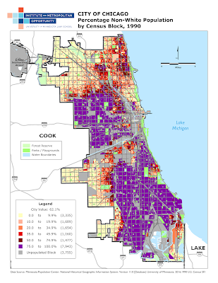
Of America's whitest metropolitan areas, the Twin Cities region is among the most racially segregated. We've made some new maps that illustrate in close detail how that segregation has grown while the region has become more diverse. Below is the city of Minneapolis by percentage nonwhite in 1990, 2000, and 2010 - click them for the full, enormous versions.
Here's 1990:
And 2000:
And finally, 2010:
Although the underlying data and patterns should be familiar to many, block-level Census data means these maps provide an unusually close look at neighborhood trends.
What's especially interesting about block-level maps is how well they capture neighborhood segregation and transition as a physical, geographic process. Oftentimes, maps of demographic trends rely on census tract data, and census tracts are large and oddly-shaped. The "shape" of what you see in census data, in other words, is determined by the shape of tracts themselves, lending trends an arbitrary geography.
But when the same data is depicted at a fine level of granularity, the underlying pattern shines through more clearly, much like increasing the pixel resolution of a photograph. And we're reminded that census data reflect very real, organic, and physical patterns on the ground.
Which brings us to Minneapolis segregation. Predominantly nonwhite communities form two distinct "blobs" on the map that grow and change over time. The dynamics of segregation -- both the inability of nonwhite residents to find housing outside of racially concentrated areas, and the tendency of white residents to flee from an area as it racially transitions -- ensures these "blobs" remain coherent and well-defined on the map, even as the city's nonwhite population grows rapidly. It's easy to trace the advance of segregation through neighborhoods and along major transit corridors, and though the map is restricted to Minneapolis, easy to imagine how this process drives waves out-migration to the suburbs, causing sprawl and stratification.
This fits with other academic findings on racial transition: neighborhoods remain stable to a certain level of diversity, but somewhere north of 50 percent nonwhite, they "tip," rapidly segregating. (Where the actual tipping point lies
may vary by year and region.) White flight, and
segregation itself, causes depopulation, trapping neighborhoods in a cycle of poverty. As these maps suggest, this process has long been underway in large sections of North and South Minneapolis.
But there are exceptions. Northeast Minneapolis (for non-locals, the area directly north of downtown, across the river) has not segregated as part of a larger wave. Instead, the neighborhood has become a multicolored patchwork - an indication of block-by-block racial diversity without clear geographic boundaries. We don't have an immediate explanation for this trend, but it's worth pointing out that Northeast has a wide variety of high- and low-end housing, newer development and older homes, comparatively little subsidized housing, and fairly intermixed commercial and residential usage. If Minneapolis residents could move to any neighborhood regardless of race, and be welcomed as neighbors, a lot more of the map would look like Northeast.
This is what we should aspire to: a patchwork quilt of a city and region, where increasing diversity is something that's happening everywhere at once, not a wave that rapidly overtakes neighborhoods.


